

AnderS Henrikson
Design Portfolio

About the Designer
Anders Henrikson is a photographer and strategic communications major diving into the design and communication ends of the spectrum in hopes of creating tailored designs that properly communicate ideas, data, and abstract ideas.
Communicating Ideas
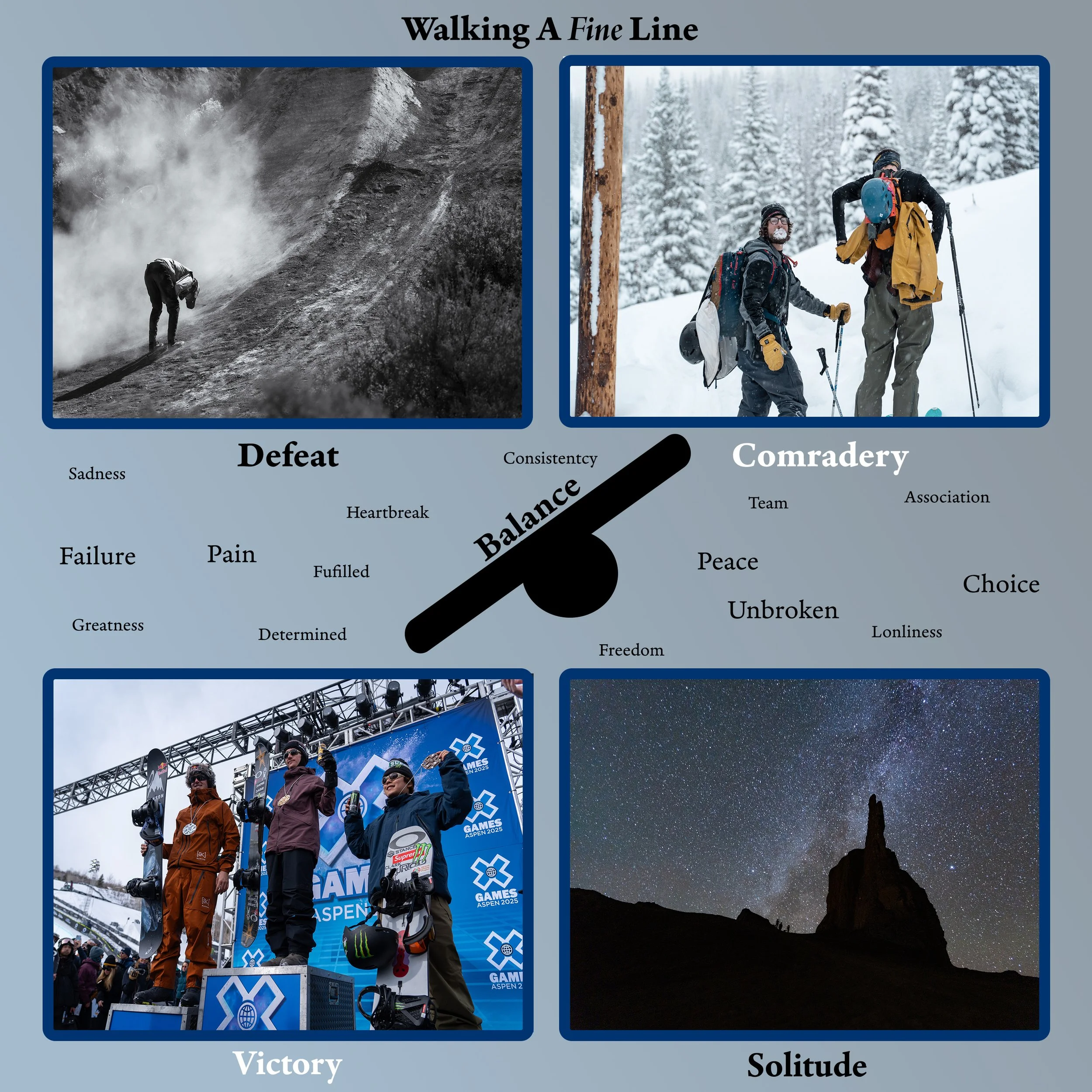
For the Communicating Ideas portfolio, I chose to make a collage that communicates abstract ideas that relate to the idea of balance. I wanted to add photos that supplement each idea. Each idea ties directly to the idea of balance.
As it is a piece of “abstract”, I wanted to keep it open to the reader to encompass each idea and how they feel they fit together.
Communicating Data
Here I chose a clean way to communicate data while not being overwhelming and providing too much data that overwhelms the reader and makes it hard to read and analyze. I chose to add small diagrams that add supplemental information to draw extra attention to each statistic and to help the reader understand the topic I was talking about quickly.
The white text contrasted well with the gradient I added, while not looking too over the top and busy.

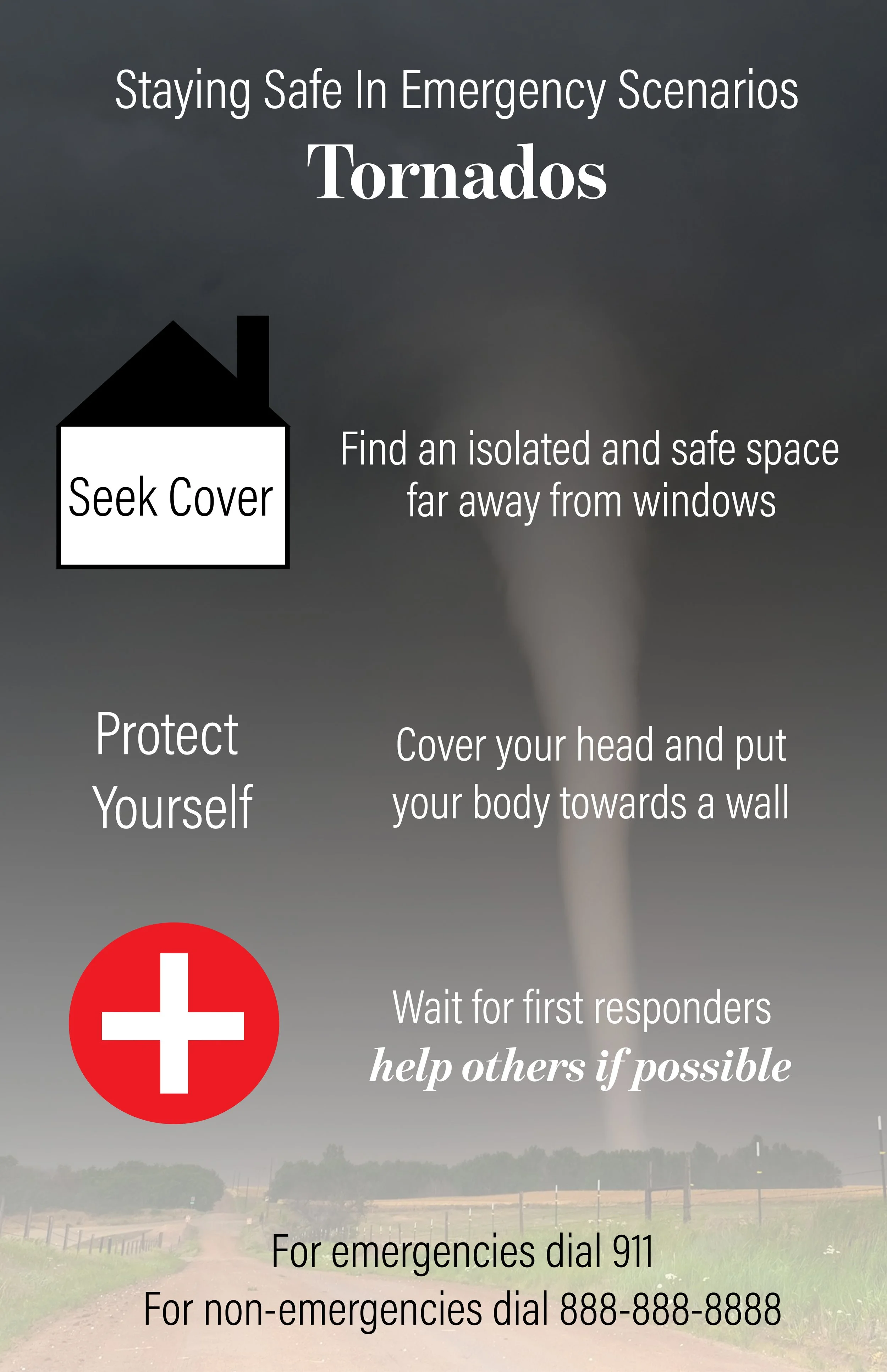
Communicating Instructions
Here, I created an instructional document to provide data on what to do in an emergency scenario. This provided a general step by step basis on what to do in a stressful scenario. The goal was not to overwhelm the reader, mainly because in a scenario like this, you don’t want to be focused on trying to read the document itself.
My goal was achieved here by adding clear instructions that weren’t too complicated and provided other information that the reader could analyze without looking at the more detailed instructions.
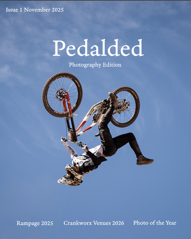
Magazine Cover
For my magazine cover, I chose to create a minimal cover that allowed for the reader to focus primarily in on the picture as the call to action, especially as this specific issue was titled the photography edition. This was ultimately inspired by the minimal type and lack of excessive text, creating a clean cover that draws the reader in.

Rebrand
When tasked to rebrand the University of Utah Logo, I wanted to create something that took a more minimal approach to the current logo. This approach prioritized the generation that grew up with a more minimal design. I drew from Apple as an example as they have primarily been known to have minimal design, which has been associated with quality and prestige by most in the industry.
The type was far from over the top with thinner, easily readable text that the viewer can easily look at and understand what they are looking at.
PostCard
With the postcard assignment, I provided the call to action, encouraging the reader to visit Yosemite by providing evidence on why they should visit. In this case, the evidence was the photo that provided a call to action by showing off the beauty of the park. I added an area for whoever is sending the card to write and message in, which, in hindsight, I should’ve made it in a color that was more friendly to someone who may be writing in pen, which would be most people. I also added a few elements like the stamp and the California state bear, to give the reader more context.

Case Study - Understanding Crime
Understanding Crime I felt, was one of my stronger pieces. It provided raw data for the reader to look at while providing other supplemental information for the viewer to look at and relate it to the data that is being communicated. The contrast and blending were good in this case. The white text stood out on the blue background and was not an eye sore.
The diagrams could have used a little more work in this case, however. The second diagram did not really provide any sort of relation to the data being shown below, except for the fact that it was a bar graph, and bar graphs also show data. I admittedly could have done a lot more to create something or find something on the internet that better showcased the statistic in which is was trying to relay to the reader.
However, it did still use the general type and minimalistic style in which I was relaying through my past projects. The spaced out type on the top with larger font made it clear that it was the title without seeming out of place and unneccesary.
In general, I think this piece did the best in portraying that style when compared to my other projects. The rebrand, I felt, was a little too minimal and did not provide many reasons for the viewer to choose the U over any other school and relied far too much on the pictures to create a relationship with the viewer. If I were to go back, I would definitely prioritise this general design style on the Communicating Instructions piece, as I felt that piece did not adhere to that minimal yet telling style that I feel I did better on this one. The diagrams were a bit more polished in this draft than in the other one and did not seem out of place, whereas in the instructions piece, they did not really follow a specific style.
Overall, I felt this piece was more tailored to the statistics that it was communicating with more supplemental information and a stylised hierarchy that emphasised the more important bits and pieces that I wanted to portray in this piece.